In the world of home design, color is far more than an aesthetic choice—it’s a tool that influences mood, perception, and spatial experience. For homeowners and buyers in Santa Fe, NM, where architecture and design are often closely tied to regional history and natural surroundings, selecting the right color palette is essential. Whether preparing a property for market or simply refreshing interiors, knowing how to choose colors for a room can significantly impact how a space looks, feels, and functions.
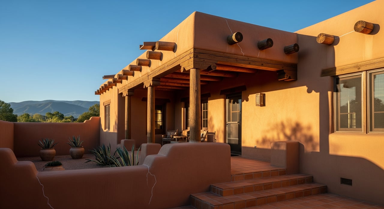
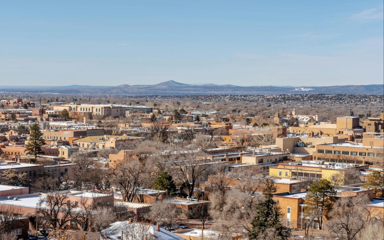
Santa Fe’s distinctive style—a blend of adobe architecture, southwestern motifs, and earthy materials—lends itself to both bold and subtle color applications. Yet, even within this iconic aesthetic, the selection of interior paint colors should be intentional, rooted in both design principles and the science of how color affects our emotions and perception of space.
The Psychology Behind Color Selection
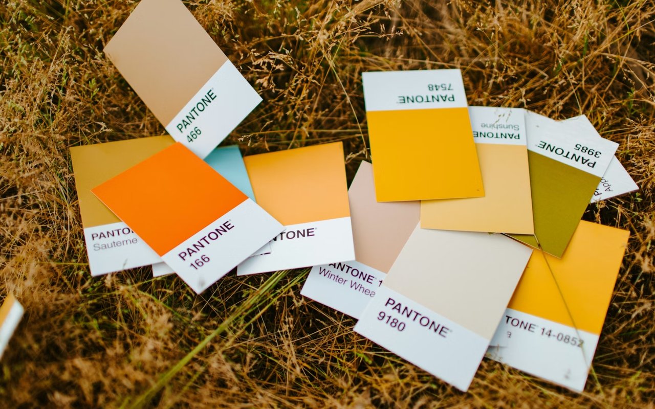
Color theory isn’t just for artists—it’s foundational in real estate and interior design. When considering how to choose colors for a room, it’s important to understand how different tones affect human behavior and emotion. Warm colors such as red, orange, and yellow are known to stimulate energy and encourage conversation, making them well-suited for social spaces like dining rooms or kitchens. Cool tones like blue, green, and violet have a calming effect, ideal for bedrooms, bathrooms, and reading nooks.
Neutral tones—including whites, grays, beiges, and taupes—offer versatility and are especially valuable in real estate settings. They create a clean canvas that allows architectural features to stand out, while also appealing to a wide range of buyers. In Santa Fe, many homes incorporate soft desert-inspired hues such as sand, clay, and sage, which harmonize with the landscape and traditional building materials like adobe, wood, and stone.
Psychological responses to color can also vary based on light exposure and room function. For instance, in a north-facing room with cooler natural light, warmer tones may help balance the overall feel. In contrast, a sun-drenched room with strong southwestern exposure might benefit from cooler colors that soften the visual heat.
Coordinating Color with Room Purpose
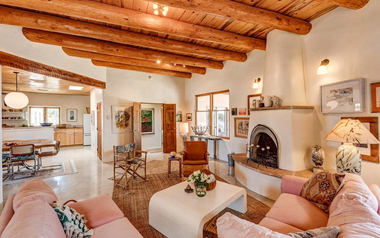
When deciding how to choose colors for a room, context is everything. The function of a space should guide the choice of palette. In living rooms or gathering spaces, many homeowners opt for earth tones that reflect the local landscape—ochre, terracotta, soft brown, and olive greens. These colors are welcoming and grounded, enhancing comfort and connection in shared areas.
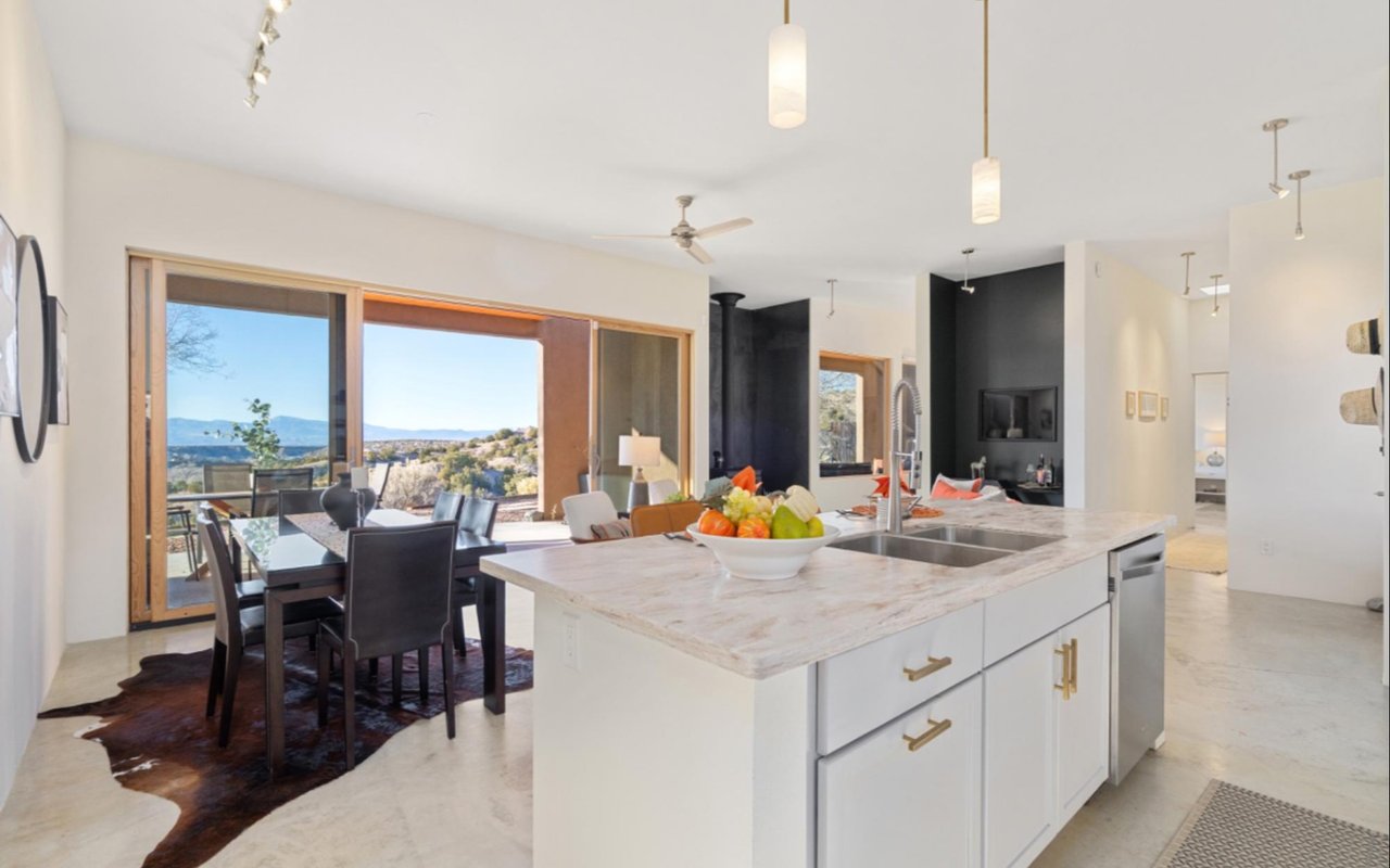
Kitchens, especially in Santa Fe homes, often combine utility with visual interest. While natural wood cabinetry and rustic finishes are common, the right wall color can either make the space feel airy or intimate. Light, warm tones like creamy white, soft yellow, or pale sage can brighten a kitchen without overpowering it, especially when paired with stainless steel appliances or artisan tilework.
Bedrooms benefit from cool, restful tones that promote relaxation. Soft blues, muted greens, or subtle lavenders are often ideal for primary bedrooms, while guest rooms can accommodate slightly bolder choices depending on natural light and size. Bathrooms, though often small, offer an opportunity to experiment with color in creative ways—powdery blues, soft grays, or even moody charcoals can add drama without overwhelming the space.
In multi-use or transitional areas like hallways, mudrooms, or entryways, continuity is key. Neutral palettes help maintain a visual flow from one space to another and allow furnishings, artwork, or architectural details to take center stage.
Considering Light, Space, and Surface
Lighting—both natural and artificial—dramatically influences how paint colors appear in a room. A shade that looks warm and soft in one room might appear stark or cool in another due to variations in light exposure, ceiling height, and wall angles. For homeowners wondering how to choose colors for a room, it’s essential to test samples in each room under different lighting conditions before committing to a final choice.
In Santa Fe, where many homes feature thick adobe walls, deep-set windows, and exposed beams, the interaction between light and surface becomes even more pronounced. Matte finishes tend to absorb light and create a softer look, while eggshell or satin finishes reflect more light and are easier to clean—making them ideal for high-traffic areas.
Ceiling color also plays a subtle but significant role in a room’s overall tone. While white is often standard, using a slightly warmer or cooler white, or even a hint of the wall color, can change how the ceiling interacts with the rest of the space. This technique can make a room feel taller, cozier, or more architecturally integrated.
Flooring and fixed finishes—such as countertops, tile, or woodwork—should also be factored into the decision. Colors that complement or contrast well with these elements create cohesion and elevate the sense of intentional design.
Harmonizing with Santa Fe Style
One of the most unique aspects of how to choose colors for a room in Santa Fe is the opportunity to incorporate regional inspiration. The city’s palette is influenced by the surrounding high desert landscape, native flora, and centuries-old architectural traditions. Homeowners can draw from the natural colors of the Sangre de Cristo Mountains, the golden tones of local grasses, or the rich reds of canyon rock.
For those preserving or restoring historic properties, choosing colors that reflect the original character of the home is often recommended. Earthy pinks, weathered blues, and sun-washed terracottas pay homage to tradition while still feeling fresh when paired with contemporary furnishings or art.
In modern Santa Fe homes, more contemporary palettes can also work beautifully—think crisp whites with black accents, deep navy with brushed brass fixtures, or a monochromatic tone-on-tone scheme for a minimalist look. What matters most is that the color supports the architecture and enhances the way the room is experienced throughout the day.
The Impact of Color in Real Estate
For those preparing a
Santa Fe home for sale, understanding how to choose colors for a room from a buyer’s perspective is essential. While bold colors can reflect personality and creativity, they may not appeal to every buyer. Neutral, light, and cohesive tones typically perform best in real estate showings, allowing potential buyers to imagine their own style in the space.
Freshly painted walls in an inviting, contemporary palette can dramatically improve first impressions and increase perceived value. Color not only impacts visual aesthetics—it affects how large or small, light or dark, warm or cool a room feels. In a competitive market like Santa Fe, well-chosen paint colors can make a significant difference in attracting offers and securing a sale.
Consult With Plaza Group Santa Fe to Make Smart Design Decisions
Choosing the right paint colors can elevate a home’s design, mood, and market appeal. Whether you're updating your home to enjoy it more fully or preparing it for a successful sale, the right guidance ensures your choices are both beautiful and strategic.
Plaza Group Santa Fe offers expert insight into local design preferences and real estate trends. For personalized advice on how to choose colors for a room, reach out today and let their experienced team help you bring your vision to life with confidence.